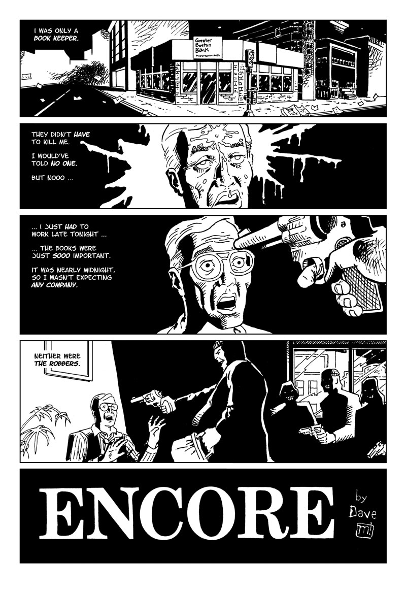
Encore
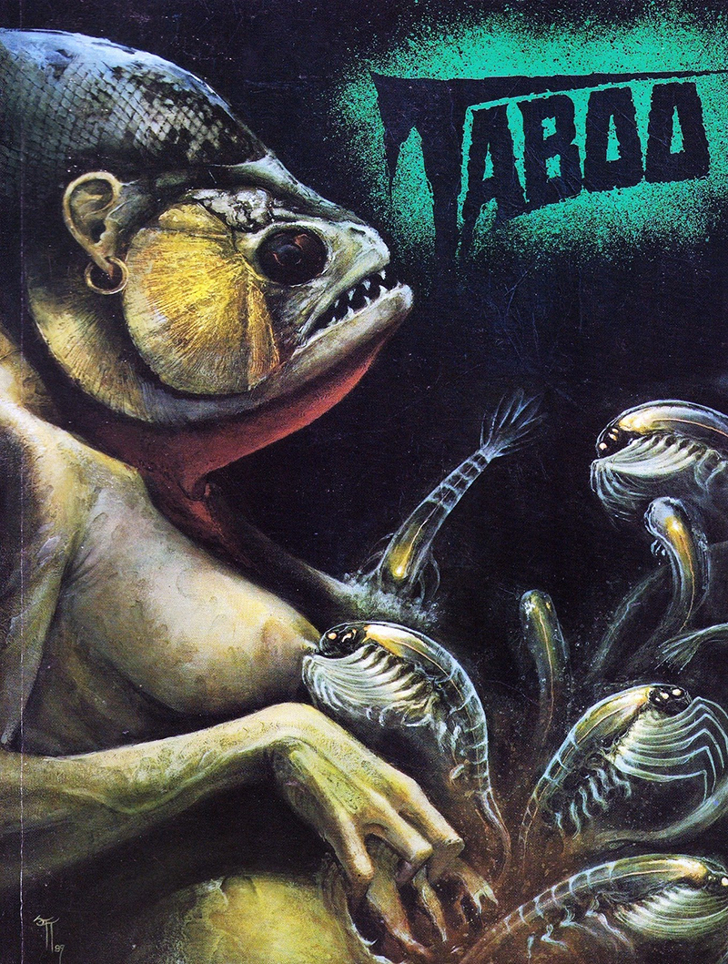
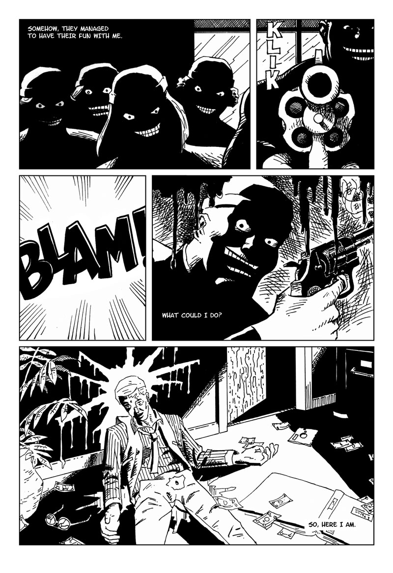
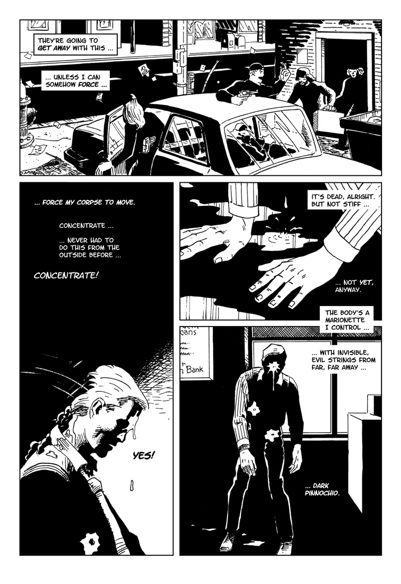
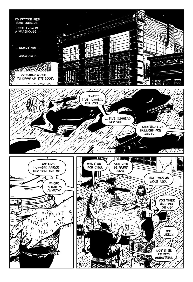
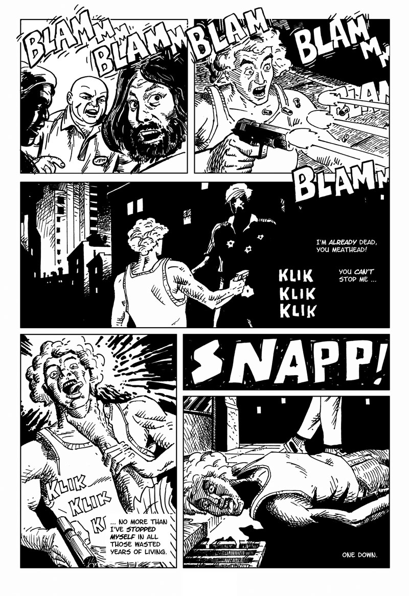
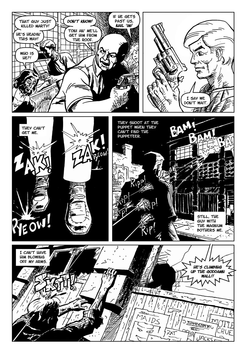
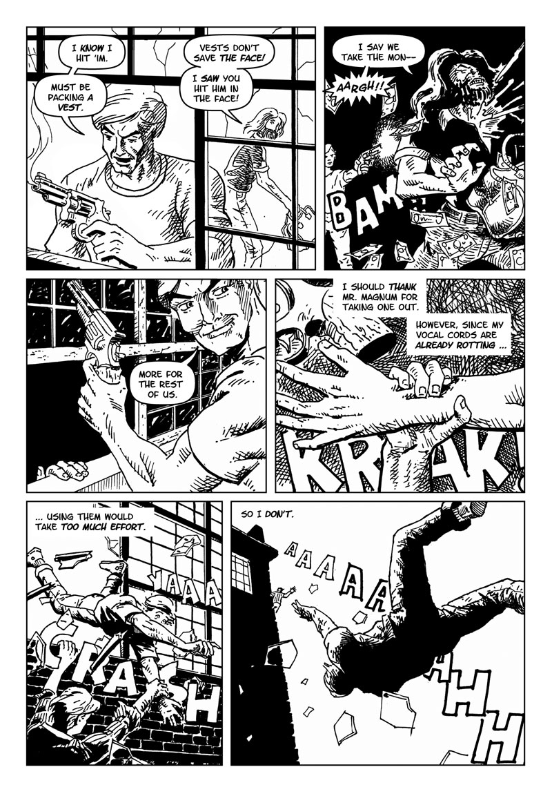
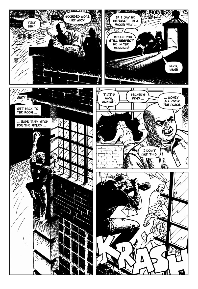
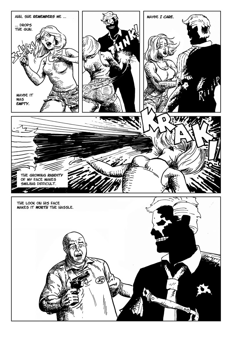
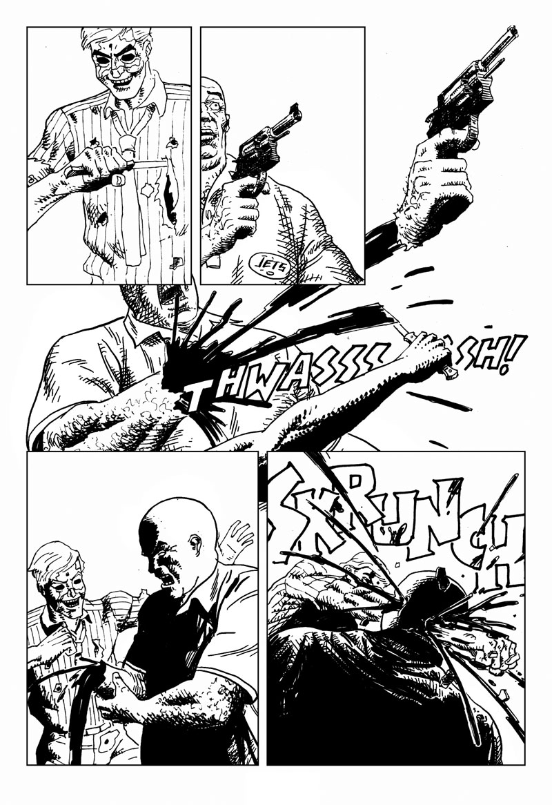
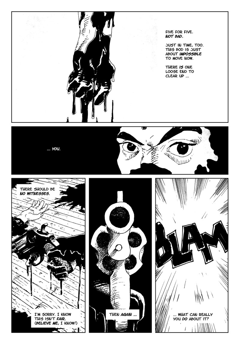
This supernatural revenge thriller exposes the side effects of one man's built-up frustrations. Our protagonist is a CPA who, in a race against rigor mortis, seeks revenge on the bank robbers who murdered him. Published in Taboo, a horror anthology published by SpiderBaby Grafix.
Story Notes
My first published credit. While working full time as a junior designer and "stat rat" for Gregory Fossella Associates, I produced this story on a hot Summer week in 1986. I was trying to make a fun, violent story for Savage Tales, a black-and-white Marvel magazine edited by Larry Hama. The first volume told sword and sorcery stories like Conan, Red Sonja and Kull. Their second run in the mid-1980s had a modern, military/mercenary policy. One look at a typical cover shows Larry wasn't buying surprise-ending supernatural zombie stories. At the time, I was convinced I could magically talk him into it, once he saw how brilliant my story was.
Thank God for Steve Bissette. While I was toiling away on a comic book bridge to nowhere, he stopped working on DC's Swamp Thing with Alan Moore and John Totleben to publish is own horror anthology Taboo. Bissette's promotional tour brought him to New England Comics, literally 2 blocks from my Allston apartment. Steve bought the story right there on the spot!
Looking at it now, I still think the storytelling's pretty good, fused with "young buck genius". The art, however, is hampered with indecisive inking. Operating under the influence of different inking philosophies, I never merged the style conflicts into a single, consistent voice. Should I use the "morse code" messy look Barry Smith used on "Red Nails", or the "quick-motion thin line/thick brush" technique favored by Frank Miller (by way of Carmine Infantino and Hugo Pratt), or Moebius' open line? As an added element, I decided to use a technical pen for the thin lines, but reverted to dip nibs as the story progressed.
I recently took a shot at improving the art, correcting errors that've bothered me for years. In the published version, the gang's overweight leader is shirtless for no apparent reason. The drawings of his girlfriend look like I'd never seen a woman before. Digitally correcting these errors in "pencil" was easy; matching my '80s inconsistent inking style with Corel Painter was a lot tougher. In the end, I think this enhanced version looks as good as possible.
Speaking of digital dishonesty, the lettering has also been overhauled. Dave Sim was kind enough to letter the '80s version. When remastering the scans, I wanted everything on the page to be "mine", but didn't possess my current hand lettering skills. Thus, the Letter-O-Matic font seemed like a great compromise. The vector word balloons, however, are modeled after Artie Simek's.
David Marshall, surviving a heat wave from Somerville's True Grounds Cafe & Coffeehouse