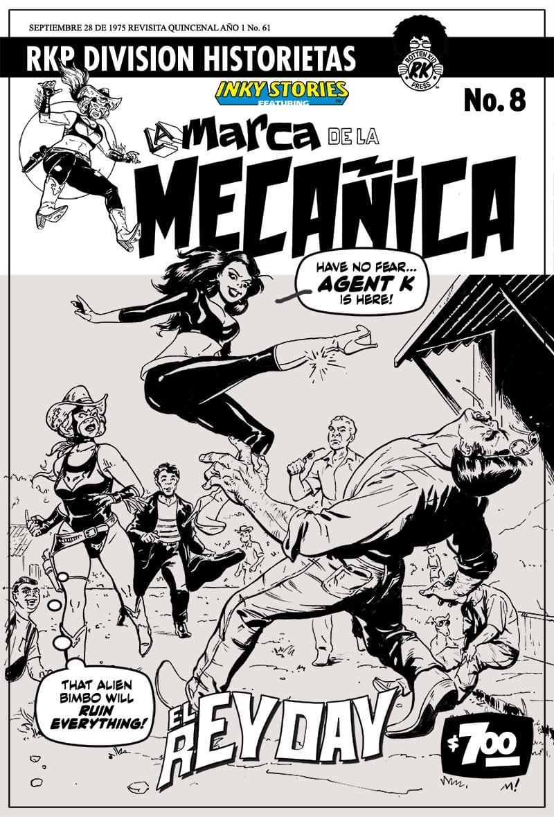
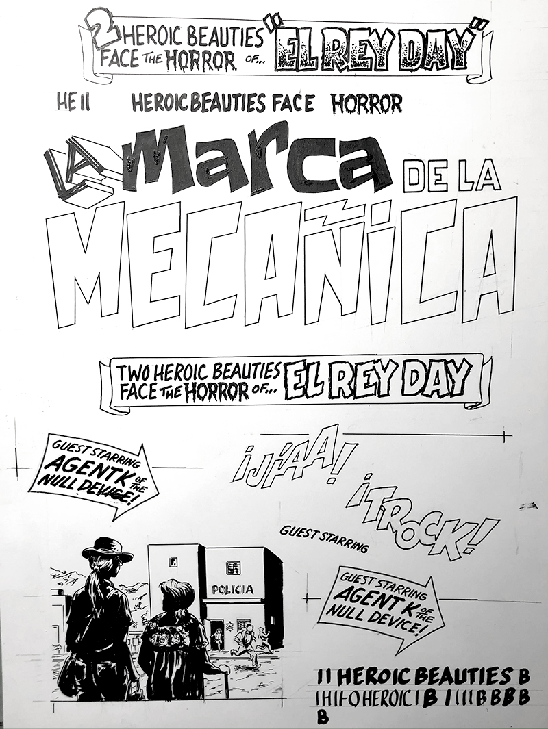
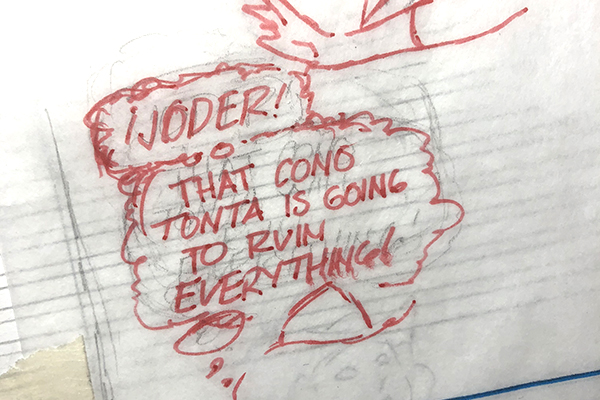
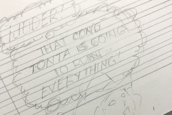
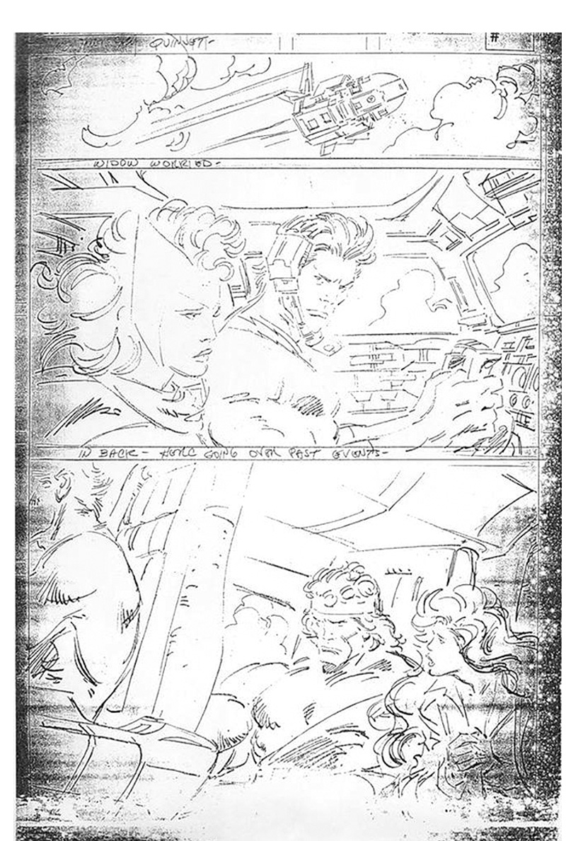
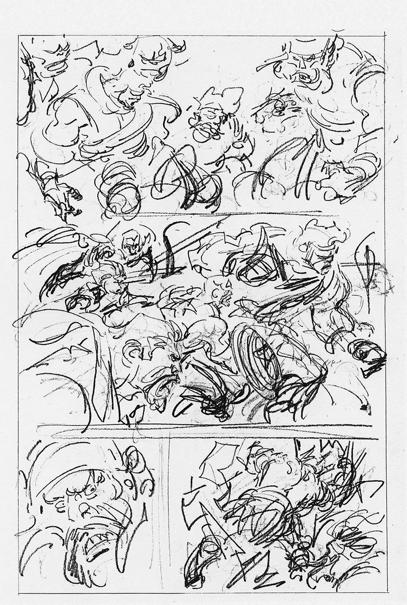
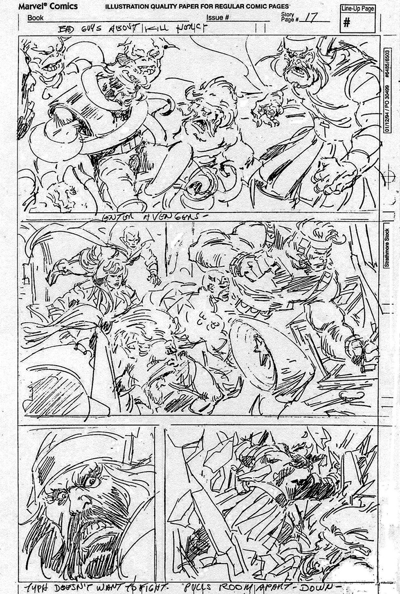
Examples
Stages
My comics creative process broken down into tasks:
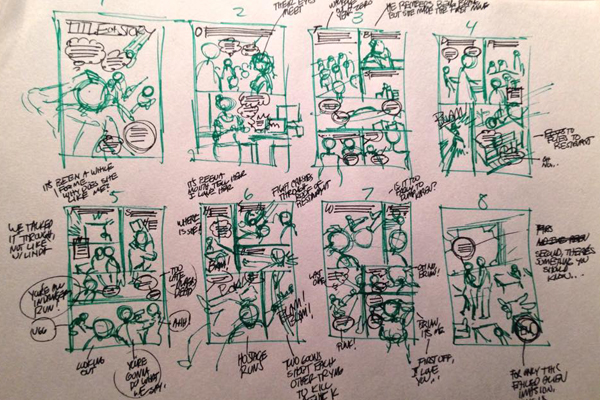
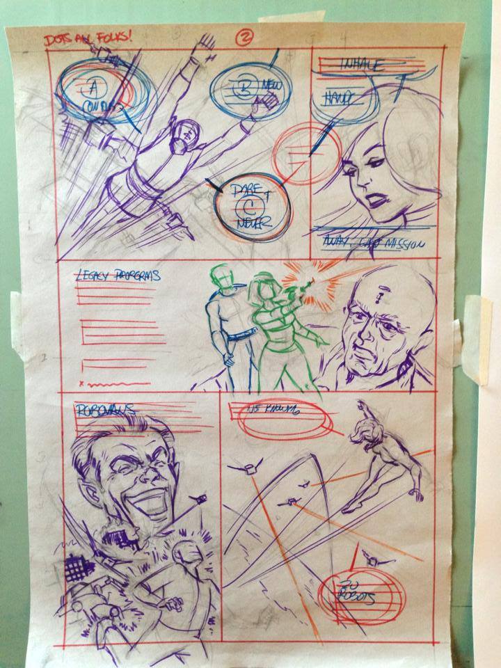
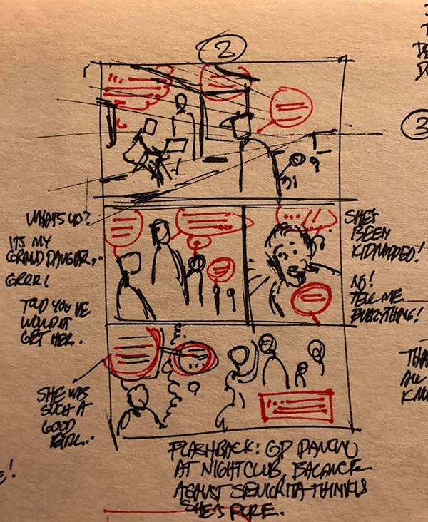
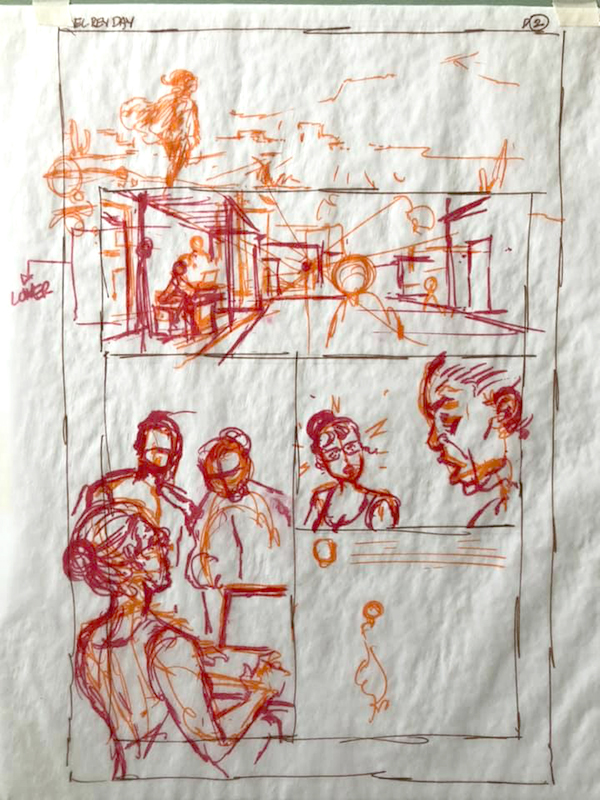
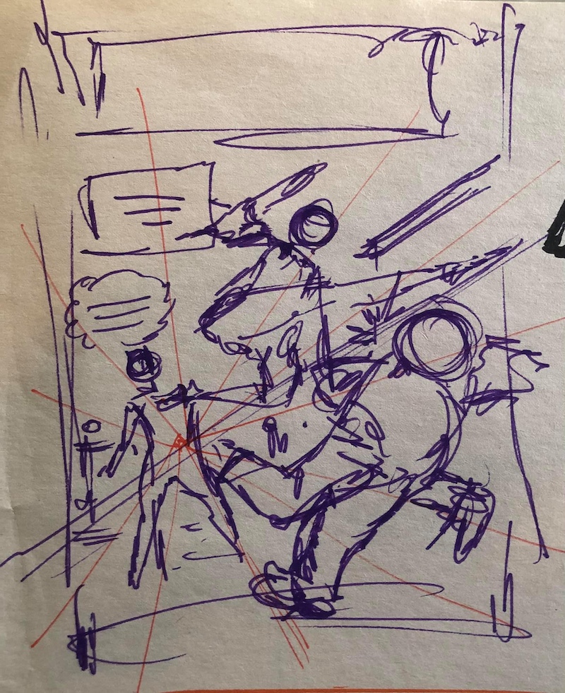
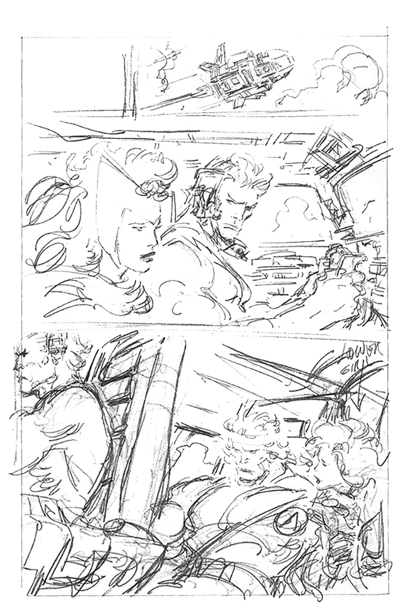
The first round is a frantic process to capture the raw idea before it gets lost. I think of it as reader experience design. The story gets broken down into page layouts with chicken scratch drawings, margin notes, and just enough script indications for storytelling.
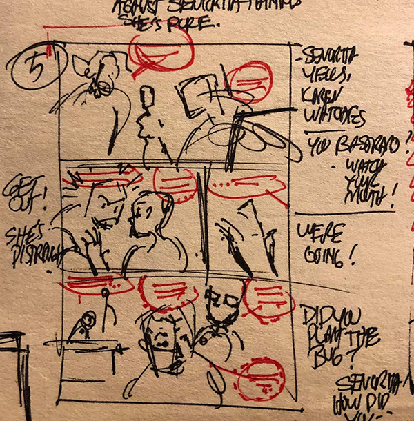
The second round is for clarification, tightening up drawings and wording (exposition, jokes, responses, etc.) and reference needed to write the script.
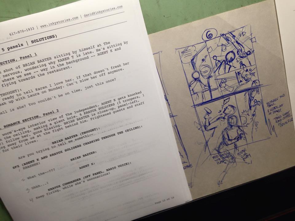
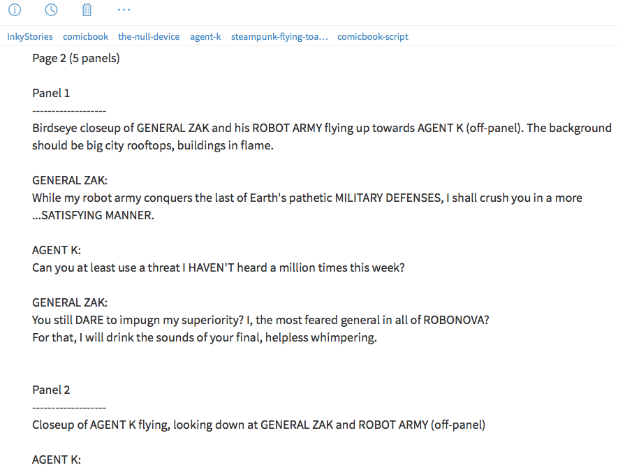
This is where I write actual dialog and captions for publication. After transcribing from my thumbnails, the full script is written as if it were going to another artist, complete with page breakdowns and panel descriptions. It's the only way I can craft dialect, prune out unnecessary exposition. This is where I struggle between clarity and entertainment. Once I'm satisfied, it's onto the breakdowns!
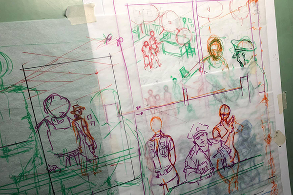
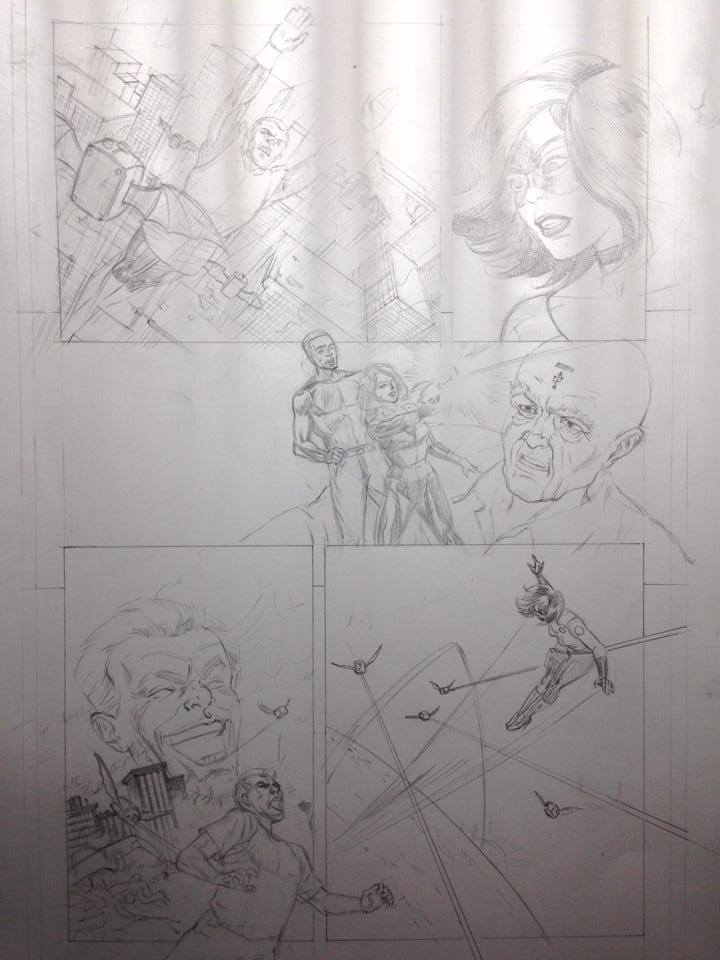
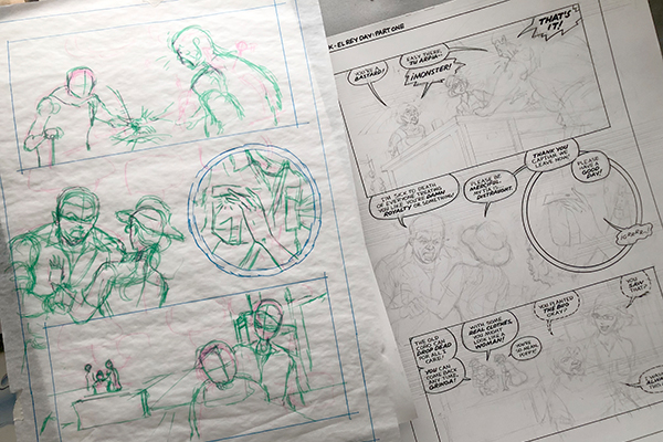
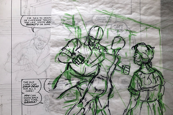
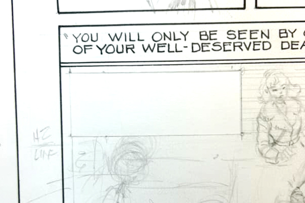
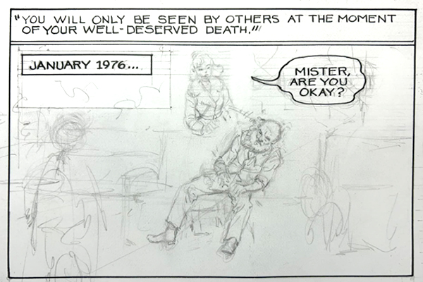
This is a merge of thumbnails with the finished script at live art size. My quick handwriting is a pretty good indication for how the lettering flows. Any wording deviations (unanticipated clarity issues, typos, new storytelling ideas) to back to the script for final art and lettering. The drawings are usually done on newsprint or tracing paper with cheap magic markers, a different color for every element (art, borders, and lettering). After the entire story's finished in script and breakdowns, it's onto producing final art!
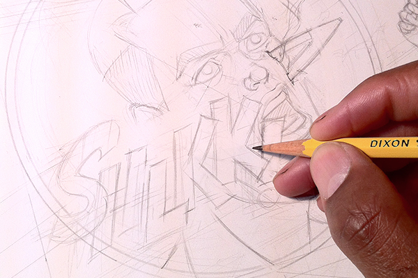
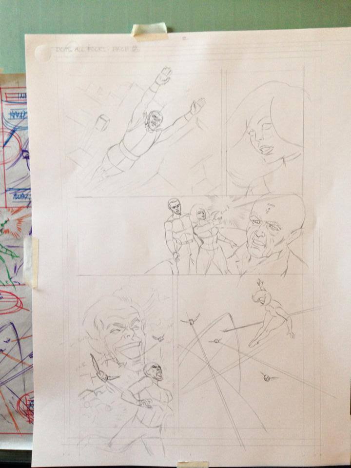
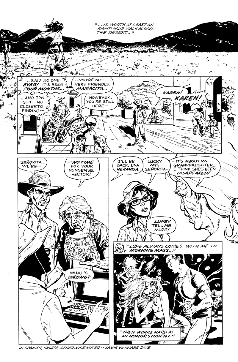
Going straight to briston paper got pretty messy. I've since adopted the John Buscema lightbox method of tracing rough drawings onto professional paper. My first was an old fashioned wooden model from 1980-something. I switched to the Artograph LightPad 930 in 2015. It's just as heavy as my wooden light box, but thinner and easier to use.
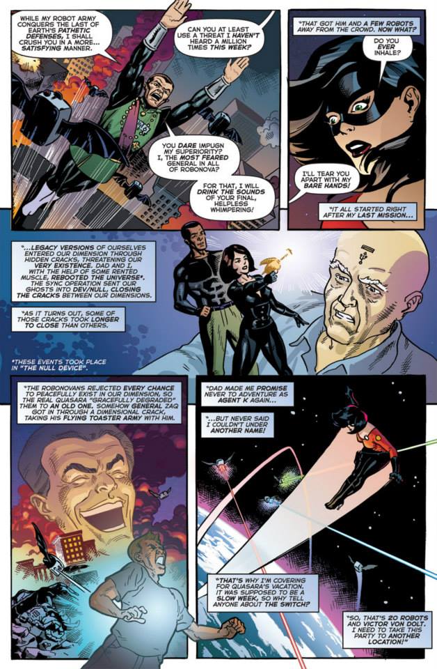
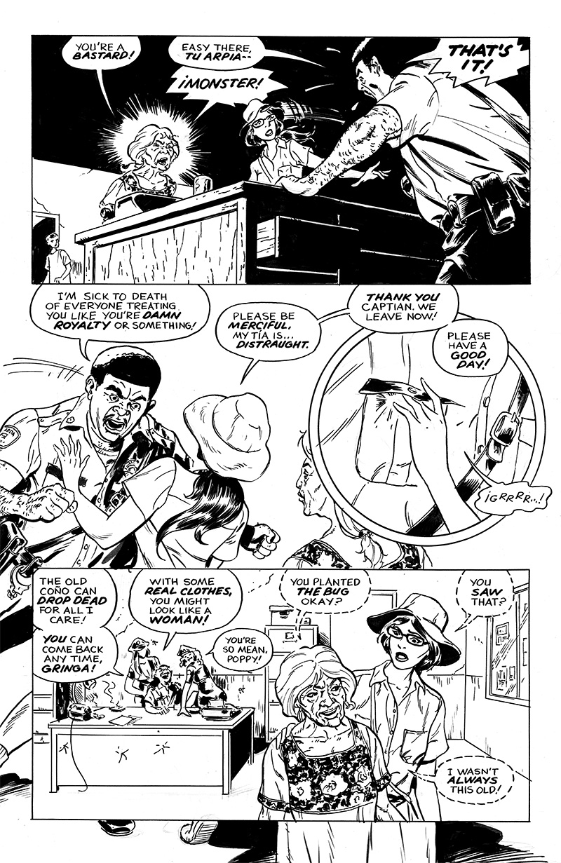
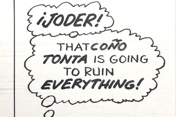
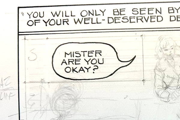
My traditional dialog lettering is Hunt 107 over Ames 3.5 two-thirds for 10 x 15 inch pages, and Speedball B6 over Ames 4.0 two-thirds for 12 x 18 inch pages. I started off emulating Artie Simek, but am now warming up to youthful upstarts Gaspar Saladino and Danny Crespi. My digital lettering default is CC Samaritan 6 points (6.5 leading) on print-sized files. Nate Piekos and Patrick Brosseau blogs are my go-tos for process and creative production. I'm also a huge believer in thought balloons.

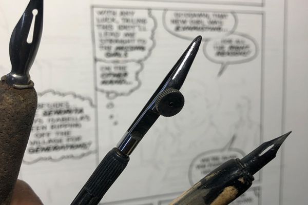
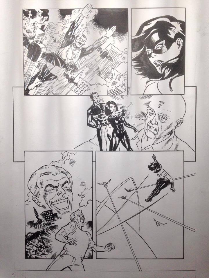
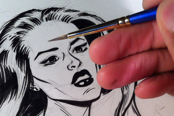
My tools are Speedball Super Black india ink on Strathmore 500 two-ply plate bristol, various drawing nibs, and round sable brushes. Lately I've been using the Marc Deering three-step brush tip preparation technique for drawing extremely thin, delicate lines.
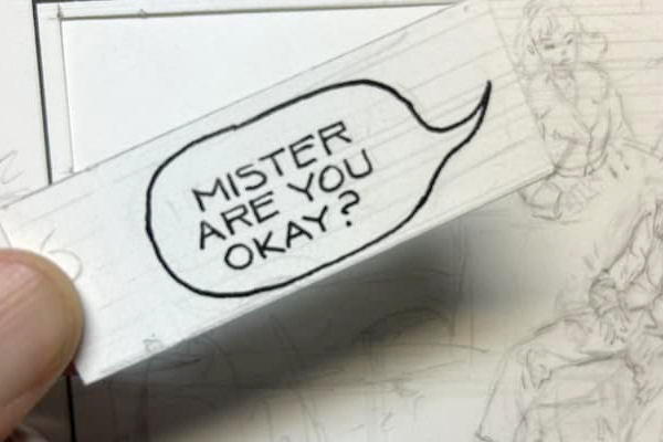
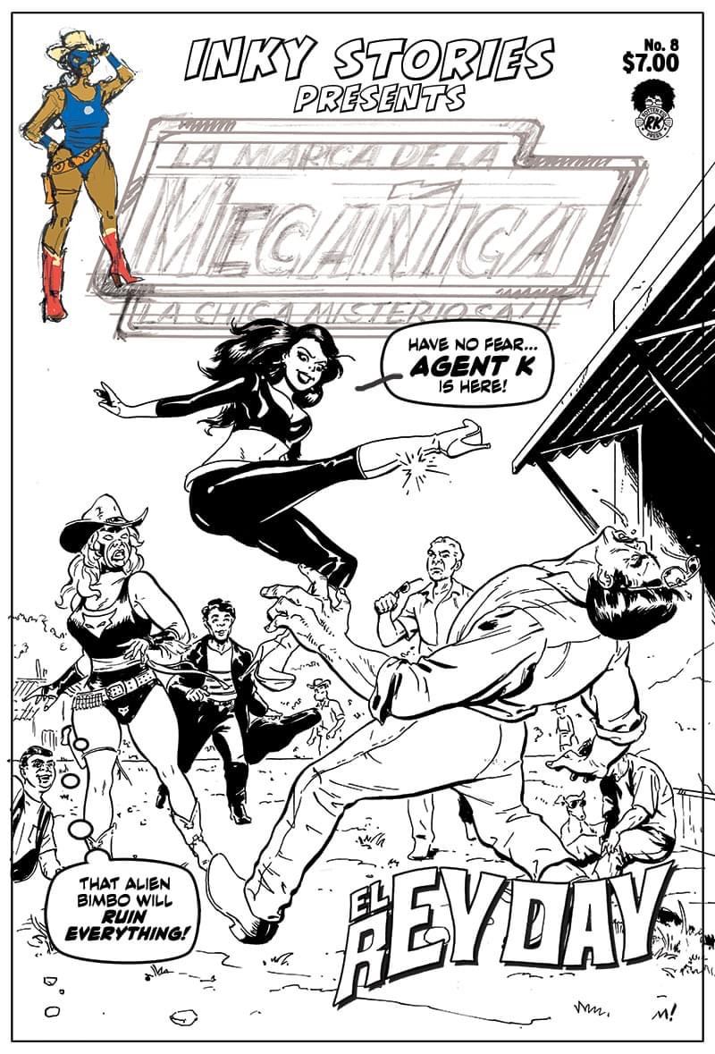
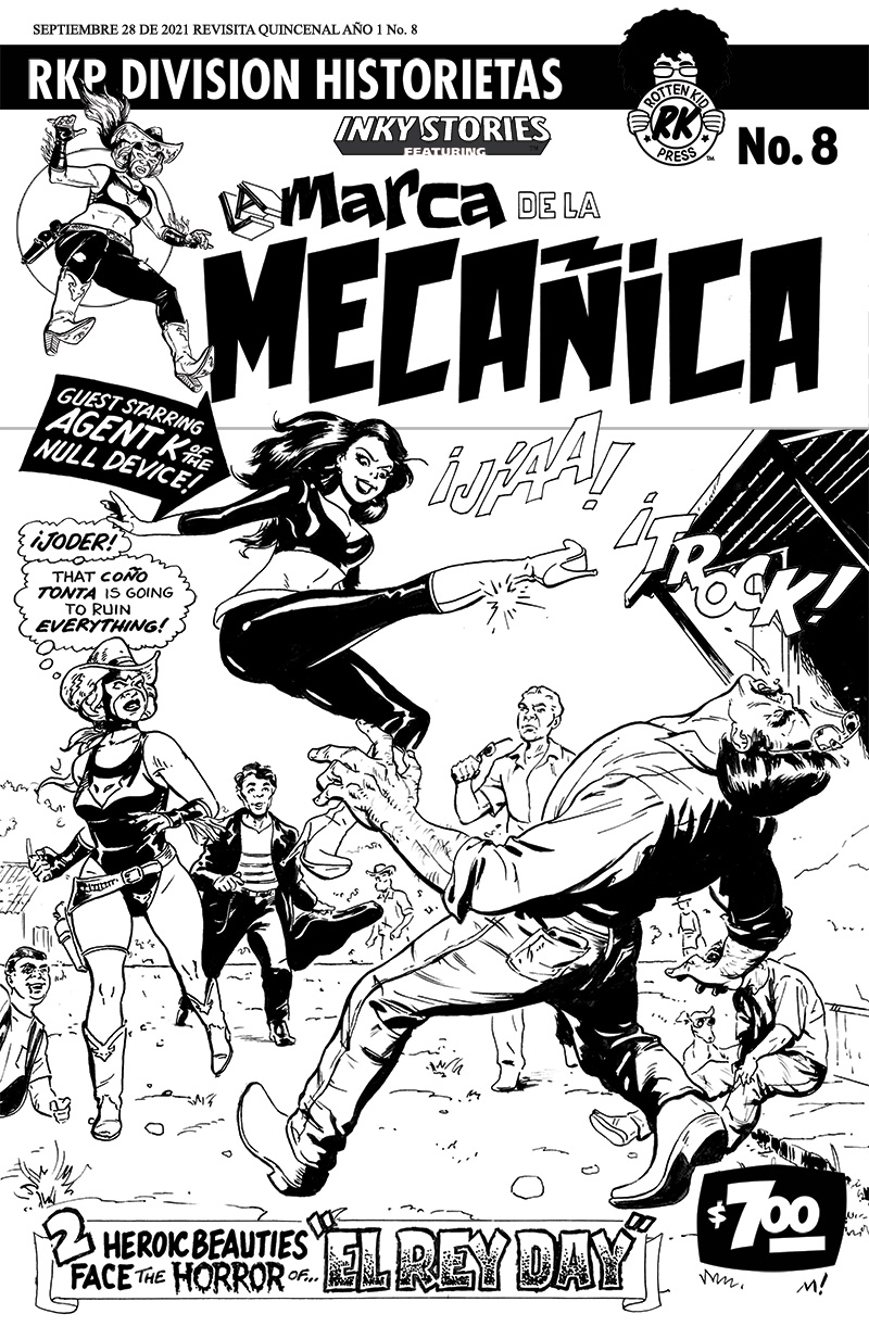
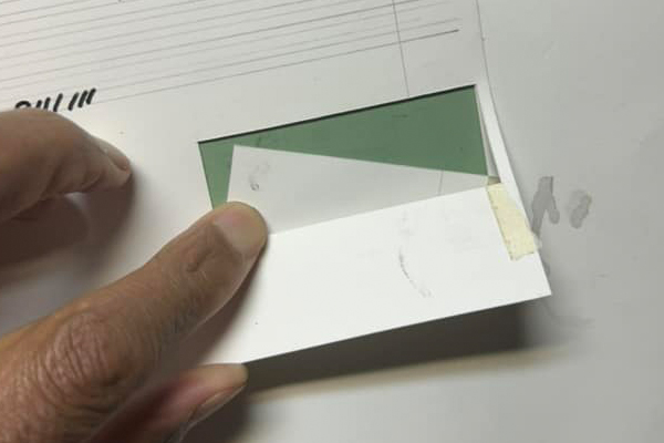
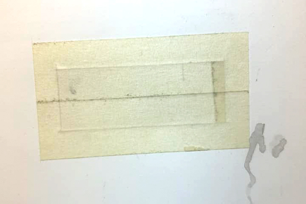
I occasionally do these as old school paste-up to keep the original art looking like the printed the printed page, but Photoshop is honestly a lot faster.
Dave Marshall, resurrecting the school they tore down to build the old school.
