Why redo an old story?
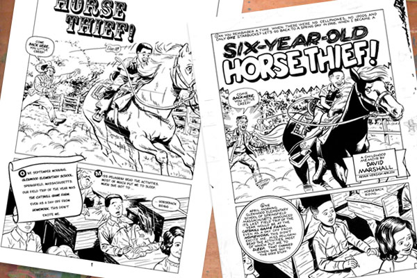
The 2012 version is an analog redo of the 2001 digital work. This rare side-by-side comparison presents each page, digital version on the left. The analog version was drawn at the classic 6" x 9" aspect ratio, the digital at a modern 6" x 9.5" to match current industry standards.
After making comics digitally for a decade, returning to traditional media started to get appealing by 2012. Teaching Art of the Comic Book in 2009 and seeing original art at conventions piqued my interest. The first ink-on-paper story since 1990-something was "Lucky Seven: The Dee Brown Incident" (2009), followed by "Bottle of Red" and "School Fight!" (2011). This effectively ended my digital era in 2012 with "Zip's Last Day" and "The Null Device.
As I began showing my new traditional work to editors, the original "Six-Year-Old Horse Thief" seemed like an embarrassment. It looked timid next to the work of my favorite pre-1960s artists, which include Alex Toth, Bill Draut, Dale Messick, Jack Kirby, June Mills, Ramona Fradon, Valerie Barclay, Lee Elias, and Matt Baker. Revising old work is probably stupid, but I had no new material, wanted to stay busy, and couldn't resist the urge to tell a popular old story with my current style. Most seem pleased with the newer version; your mileage may vary.
Dave Marshall, drifting down Memory Lane from Somerville's Union Square
Page One
2024 redux verdict: 3/4 horse hoofs. Overall page design and storytelling are better, but I wish I kept the two-stage "wake up" of the second panel.
- Original notes from 2012
- Panel 1: The digital version's triple-stack title looks nice, but the awkward space on its right looks odd. I dreaded the thought of matching the font by hand. Luckily a better solution came along. Tom Orzechowski posted examples of Hopalong Cassidy comics, with the perfect title/logo treatment I didn't know I was looking for.
- Panel 2: I tend to make objects larger on paper than I do on screen. This, combined with the shorter page height, forced me to alter the design a bit. For instance, combining both captions into a single one area allowed me to add more drama to the art.
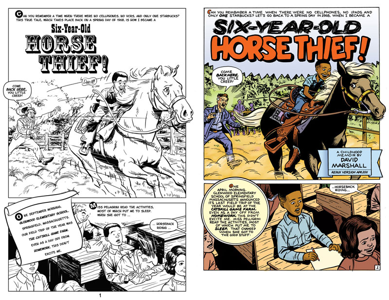
Page Two
2024 redux verdict: 2/4 family circuses. The original's top panel drafting and storytelling is way better.
- Original notes from 2012
- Panel 1: I'm happier with the character's posture in the newer version.
- Panel 2: As part of the fantasy/reality contrast, I thought we needed a "Living Just Enough for the City" depiction of drug use.
- Panel 3: In 2001 I took reference photos of the story's setting, Springfield Massachusetts. They tore down 110 Cedar Street years before. Luckily there was no shortage of similar, almost-condemned ghetto tenement buildings. I used the building on the corner of Bay and Marion streets as a guide, taking reference photos of all four sides. When shooting the final side, a dark alley, I accidentally stumbled a drug deal. I was able to convince them that my camera had nothing to do with them, rushed the building shots and got out as quick as possible.
- Panel 4: The biggest challenge was emulating the Bil Keane "Family Circus" style ... he didn't draw black people. I merged known elements of his style (solid black hair + bumpy hair = afro). The bum is based on Fred Sandford, plus a Keane drawing of "a beatnik".
Hopefully the contrast between the pretend world in my head and the ugly reality of my neighborhood is more apparent in this version.
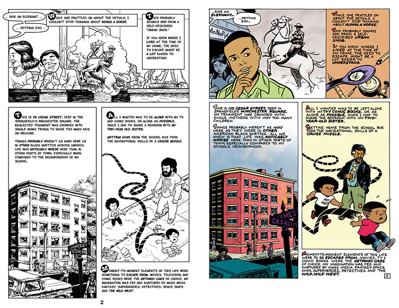
Page Three
2024 redux verdict: 3/4 back issues of TV Guide. After all that work on the first panel, I now think the first version's better storytelling. The collage and photo trace expresses vulnerability, while the new drawing shows enthusiasm.
- Original notes from 2012
- Panel 1: The original shows a B.S. collage treatment that doesn't accurately reflect the caption. Coming up with a better solution took about 2 weeks, halting my page-per-week progress. Decided to show the kid playing in a pretend battle, probably at the crack of dawn while Mom's trying to sleep. The living room is modeled after a few old photos, my personal memories and Google Image for objects (television, stereo, cowboy outfit, various background elements).
- Panel 2: The previous mimeograph didn't match my memories, but was the best available photo reference I could find in 2001.
- Panel 4: I changed the kid's reaction shot to face us, emulating my son's "Happy Dance".
- Panel 5: The circle panel is a nod to the Simon/Kirby comics of the 1950s.
- Panel 6: The school bus is much more historically accurate to 1968 than the previous version. Revisiting my old photo references shows that I accidentally drew a bus build in the 1980s!
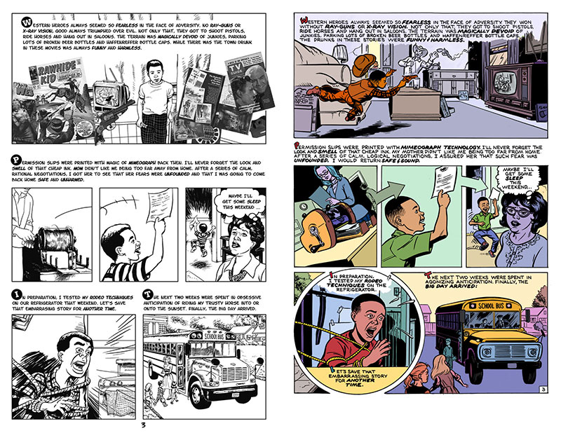
Page Four
2024 redux verdict: 4/4 game farms. Way better drafting, storytelling, and page layout.
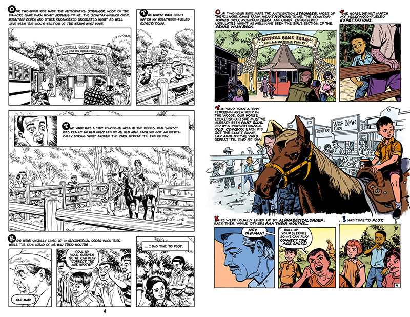
- Original notes from 2012
- Panel 1: Same composition with stronger inking. The digital version's trees aren't drawn all the way through, hoping to get covered up with lettering. Revising the script revealed this error.
- Panel 2: Made the terrain more accurate. I drew the first version from memory — 35 years after the fact. This year's reference photos shows a much flatter area. Decided to have myself as the star of this panel, purely for storytelling enhancement.
- Panel 3: This was a struggle. The old west background came from recently-discovered photos, not my memory. The composition is stronger in the new version. I used the Joe Maneely think pen for distant background technique.
- Panel 4: The old man is based on Clark Gable in The Misfits. Can't remember why I didn't draw his moustache back then, but it's here now.
- Panel 5+6: Hecking kids are about the same, but with better inking.
Page Five
2024 redux verdict: 4/4 rotten kids. Better overall execution, but I wish panel 3 Dave looked more frightened.
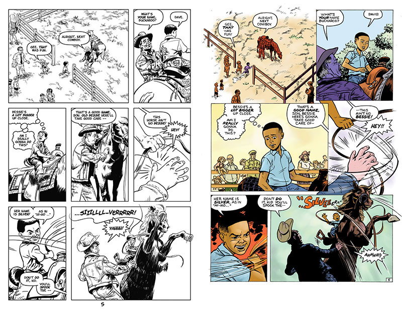
- Original notes from 2012
- Panel 1: Basically unchanged, though I did add a Misfits-era Marilyn Monroe. Reversed the horse to show her grazing.
- Panel 2: Changed the camera angle to draw less horse-butt. The old man's body posture's all wrong in the old version's off anyway; to lift Dave from this angle, he'd have to arch is back for his legs to be parallel with the established vertical plane.
- Panel 3: Merged Panels 3 & 4 from the previous version. In addition to giving me less to draw, this also speeds up the story and gives greater emphasis on the next panel. Right?
- Panel 4: Angle unchanged; added Walt Simonson-inspired speed lines. BTW, The Walt Simonson Artist Edition of Thor is worth every penny.
- Panel 5: Angle unchanged, but tighter and with better drafting. From a drawing perspective, this panel is possibly the most embarrassing from the old version.
- Panel 6: While the figures and camera angle are unchanged, the inking and integration with the words are much better. This is where the limitations of using a font really hit home.
Page Six
2024 redux verdict: 4/4 terrified horses. Storytelling and body language are way better here!
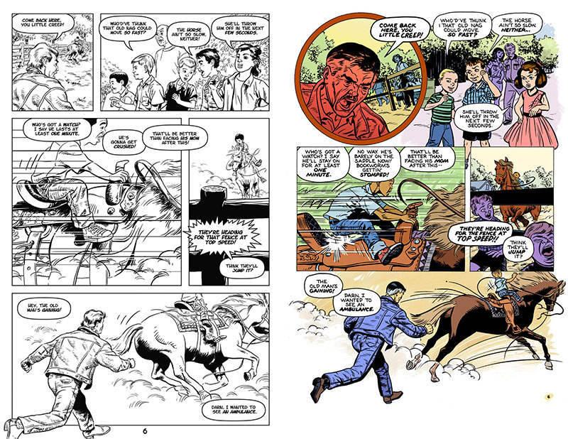
- Original notes from 2012
- Panel 1: Changed the camera angle to emphasize the old man's rage and the child bystander's amusement
- Panel 2: Changed this angle to work better with the new Panel 1. Much happier with the period wardrobe.
- Panel 3: Camera angle's the same, but the saddle's drawn much closer to scale. The kid's position and grip are much more precarious in this version.
- Panel 4: Angle's exactly the same, but added the Panel 2 Kids in a much more frightened state.
- Panel 5: Same angle, better drafting and scale.
Page Seven
2024 redux verdict: 3/4 face plants. Solid improvement overall, but the last panel likenesses should be better.
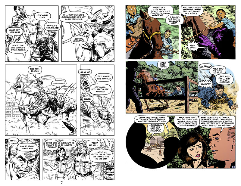
- Original notes from 2012
- Panels 1–4: Basically unchanged, except for inking and script formatting.
- Panels 1 & 2: Combined action-line styles of Manga and Walt Simonson
- Panel 3: Fence was needed to enhance the story of the embedding crash.
- Panel 4: Improved with reference of baseball players sliding head-first.
- Panel 5: Already had an angry close-up on Page Six/Panel 1. Decided to expand the dialog of our two guards.
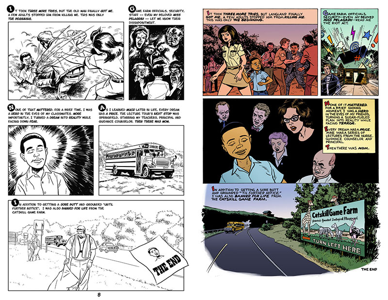
Page Eight
2024 redux verdict: 3/4 screaming adults. Overall improvement on every level. Wish I added the original's "beaming" effects to panel 3.
- Original notes from 2012
- Panel 1: Changed the angle to put more emphasis on the narrator, as opposed to the old cowboy.
- Panel 2: Moved symbolic montage to Panel 3. Needed an equally subjective, exaggerated approach here.
- Panel 3: Combined the old Panel 2 talking heads with this panel's Beaming Dave. Tried keeping the glowing effect, but couldn't coordinate it with the talking heads.
- Old Panel 4: Decided the school bus wasn't needed. Wanted to show kids leaving, but came up with a better solution.
- New Panel 4: This was the toughest one. Spent days deliberating what angle and setting would tell the story. The old version's highway is way too generic. Also decided the wanted poster only confused things.
Dan Mazur said...
Your new version of "Six-Year-Old Horse Thief" is definitely an improvement over what I would have said was pretty good to begin with. Better line, better use of strong blacks to push the eye where you want it to go. And the lettering is much more commanding. Overall just cleaner and stronger as far as selecting what’s really important and presenting it.
Hmmm… gotta have a critique, though. Okay Pg 2 — the bum is better (panel 3) , but I wonder why the kid’s face looks conniving rather than dreamy as it did in the first version (panel 1)?
So I says...
Thanks, Dan. The dreamy look of the previous version just seemed wrong. I was going for “contemplative” in Page 2/Panel 3. Drawing perfect expressions has always eluded me. Great … something else to practice!
Carl Tsui said...
Love the new "Six-Year-Old Horse Thief", especially the Family Circus reference. Success on character consistency I’d say. I still think that this all has less to do with medium and more to the fact that you’ve been practicing for 10 years. If it wasn’t better now we’d have to have a man-to-man about your life goals. Good work!
So I says...
Thanks, Carl.
Cherry Ogata said...
Quite instructive to see the two versions of "Horse Thief" compared side-by-side, then reading your thoughts about the changes in your working process over the years! Did you really steal a horse when you were six? How would a six-year-old be able to get into the stirrups?
So I says...
Thanks for the feedback, Cherry. And yes, under the influence of sugar and cowboy movies, I tried stealing this horse. Like most six-year-olds, my feet were too short to reach the stirrups. Most of these horse rides are slow motion affairs, so this wasn't an anticipated problem.
Tom Orzechowski said...
That's a really effective come-on. Now you've got me following you on FB. My memory of my one horse ride (on a similarly old nag) is that they were scary large when I was about 12. I agree on the lettering and colors and will add that the facial expressions, all the little nuances were well executed and not over done. Good job man.
So I says...
WOW. Tom Orzechowski is a veteran comics letterer, most famous for his Claremont-era X-Men.
Laurel Leake said...
Wow, Dave, what an amazing idea and an incredible challenge to give yourself! I love what you've posted so far and I can't wait to see how the next pages compare. Already the new first page reads more clearly and packs an exciting punch (I love the younger you's triumphant expression). I really liked your comments on how using digital tools affected your approach to the page...it's very hard to pick up on these things without something as clever as this!
This reminds me a little of how Brandon Graham's been (muuuch more casually) redrawing a single comic page every couple years to see how far he's come. Although his style and approach are very different from yours I thought people might get a kick out of it. It's on this rather NSFW post, but be prepared to scroll down a while before you get there.
Jesse Farrell said...
I also think the colors are really successful (and make me want to go back and do coloring, which is practically unthinkable). You make unusual choices- like the light violet for Carrol O’Connor’s eyes and teeth!- look perfectly natural. Great work.
So I says...
Thanks, Jesse. Some of the unusual color choices come from a Giraud-induced coma, aiming for subjective storytelling, page balance and outdoor lighting for specific times of day. I spend a lot of time adjusting Photoshop’s HSB sliders ’til it just “seems right”, or at least “less wrong” than everything I’ve tried so far. Forcing myself to go public on a weekly basis helps move the Wacom stylus even faster. Hopefully this will lead to a more efficient coloring process. So far, every panel’s a struggle.
Heide Solbrig said...
Great character development– from nerd to hero 8 pages. Really, really nice. Also love the Tin-Tin exclamations! Has the excellent simplicity/depth combo that makes the best comics. The color is also to die for.
So I says...
Thanks for your comments, Heide. Hopefully there’s an implied “nerd to hero to back-to-nerd” progression. Stumbling on the Tin Tin exclamations was pure luck; planning this page had so many changing elements that I didn’t know how panel 2 would look ’til all the other panels were done. Drawing panel 3 as a symbolic montage allowed me to use a pure comics solution. And thankfully, the color didn’t kill me.
Bob McLeod said...
Good job, David. You’ve obviously paid a lot of dues to get to this level of competency.
So I says...
Bob McLeod is one of my oldest industry friends and mentors. We've had spirited debates on John Buscema's relationship with perspective, which only increased my respect for his knowledge and sense of humor.
George Courage said...
Dave, I really liked this a lot. I really enjoy personal stories, I think it is an excellent use of the storytelling possibilities of sequential art. These are the “personal mythologies” that people always tell at family gatherings and events, but are rarely set down in either written or visual form, and too often, over time, they are lost and that person’s unique experience is gone. However, I also like the universality of these kinds of watershed moments from our past, where ideas and attitudes crystallize, and we learn something about ourselves (individually) as well as about ourselves (as members of the human race). Thanks for posting!
So I says...
Thanks, George. My family tortured me with this for years; looks like I’m finally good enough to tell it well. There are similar stories, but the details are fuzzy from too large a time distance. This one certainly took long enough to draw. To give you an idea of my inner Hell, here’s a side-by-side comparison of this and my first all-digital version from 2001. Perhaps this will inspire you to share one of your personal mythologies, while you’re still young enough to remember them clearly.
George and I were MassArt illustration students. He’s taken illustration, design and historical reenactments a lot further than I ever did. In addition, he’s also a terrific painter. Check out his online portfolio to see for yourself.
Mark Evanier said...
I think the writing’s great. I think the art’s great. I think you made a number of the kind of spelling mistakes that most letterers make when they’re concentrating more on form than spelling. But I really like tales like this where someone has a story to tell that they’re passionate about telling. Good work.
So I says...
Wow. Thanks for taking the time to look at my work. Your insights and work (particularly Groo and Crossfire) helped make me think I could be in this business.
Tom Skulan said...
Really enjoyable David, I loved your use of colors, the lettering and the pacing too. Exceptional work!!
So I says...
It's great hearing from Tom, the publisher who had the wisdom to commission "The Bleeding Mirror" for Gore Shriek #5, 1988.